How to make a phenomenal contact page (+ examples)

Franco Brutti
The contact page is, without a doubt, an essential part of any website. And of course, it’s essential to establish a communication bridge with users, current customers and potential customers.
This page is often overlooked in all kinds of websites, even in sites with thousands and thousands of visitors, and even in websites of international companies. However, an efficient and well-built contact page can boost your number of leads, as well as your conversions.
In this article, we'll explain everything your contact page needs in order to work perfectly. And we'll also give you some examples of real company contact pages, along with some tips on how to perfect yours.
The importance of the contact page: why it's so essential
Here are some key reasons why a great contact page is vital:
It facilitates communication: the contact page provides visitors with an easy way to get in touch with you. Here, users can ask questions, share opinions and complaints, make business inquiries or even report technical problems.
Builds trust: A professional and accessible contact page builds a lot of confidence in your visitors. It gives them the feeling that your company is legitimate and willing to listen and respond to their needs.
Encourages interaction: interaction with your visitors can multiply your business opportunities, collaborations, sales and long-term customer relationships.
Offers a variety of contact options: you can offer different emails, phone numbers, contact forms, social networks or even live chat. In other words, you make it easy for users to communicate with your company.
Collects crucial information: you can use the contact page to collect valuable information about your visitors, such as their names, email addresses, phone numbers and the reason why they're contacting you. This information is invaluable for future communications and marketing strategies.
Solves problems and questions: the contact page is a place where visitors can search for answers to frequently asked questions or solve problems. Providing useful information and resources on this page can reduce the customer service workload.
Legal compliance: in some countries - and also in the European Union - the law may require you to have a contact page on your website to facilitate communication and inquiries.
What a contact page must have
An effective contact page needs to include certain key elements to ensure that visitors can communicate with you easily and efficiently, including:
Contact form: a contact form is a common way to collect information from visitors. This form needs to include fields for the visitor's name, email address and message or query. You can also include additional fields according to your needs, such as phone number or company.
Email address: provide a visible email address and email link for those who prefer to use their email client to contact you directly. Make sure the link works.
Phone number: if you have a mobile or contact phone number, include it on the page. It’s important that it is clear and easy to find.
Physical address (if relevant): if you have a physical location, such as a store or office, show the address on the contact page -indispensable for local businesses-.
Hours of operation: if you have specific schedules for answering calls or emails, indicate this on the contact page so visitors know when to expect a response.
Social media links: Include links to your social media profiles on the contact page.
Additional information: If you have multiple locations, departments or different contact people, you can provide additional information or links to specific pages for each.
Clear instructions: provide clear instructions on how you want visitors to contact you. For example, you can ask them to include a specific subject in the contact form or to detail their inquiry specifically.
Privacy policy: include a link to your privacy policy so visitors know how their personal information is handled.
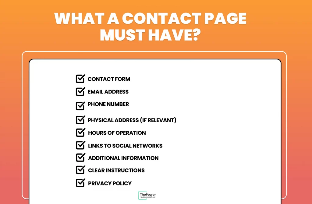
In summary, a well-designed contact page should be easy to use, provide multiple ways of communication and offer the information necessary for visitors to contact you effectively.
6 examples of contact pages you can follow
Here we will show you some of the best examples, in our opinion, of what a contact page should have. And we will also explain why they are so effective.
Tommy Hilfiger
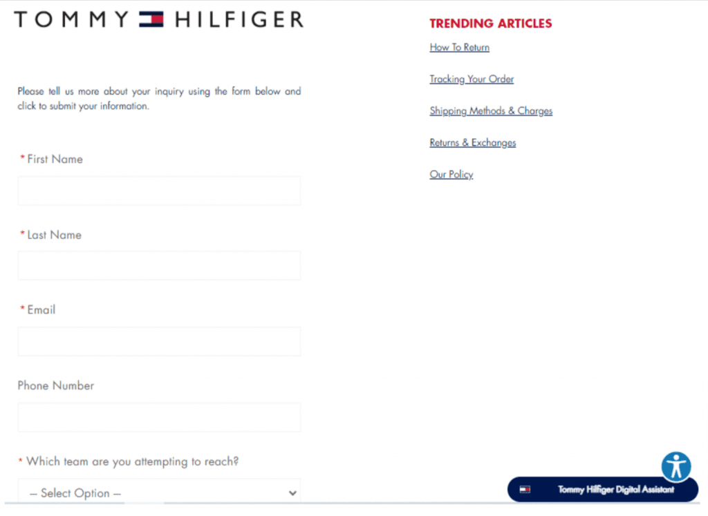
Sometimes, a simple bet is the best bet. This is one of those cases where less is more; where a simple proposal with a minimalist design is all you need to build your contact page.
This page has everything you need to contact customer service, including a live chat, opening hours, TWO phone numbers and an email. But in addition, it also offers a virtual assistant to look up all the information you need.
And on the other hand, on the right side, you can find some very useful articles about the company's policies, its stores, rebates, refunds and more.
Zendesk
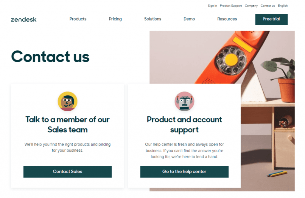
Zendesk has a simple and straight to the point page, with two pretty clear options: contact the sales team or the support team, depending on what you're looking for or what you need.
On this page, scrolling down, you'll also find contact details for all Zendesk offices around the world, from Australia to Vietnam.
The page also has a chatbot to answer your questions and help you navigate the Zendesk website.
Accenture
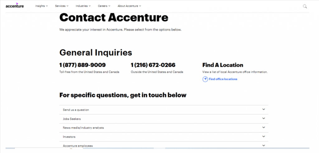
Accenture also goes for a simple page, where you can get the contact numbers at a glance. It also offers you a search engine so you can locate the company headquarters you need with a query.
But in addition, Accenture knew how to create a well segmented contact page to satisfy ALL its visitors. Unlike many pages, this one offers different contact details for jobseekers, employees, clients and investors.
In other words, each visitor receives a personalized attention well adapted to their needs.
Burger King
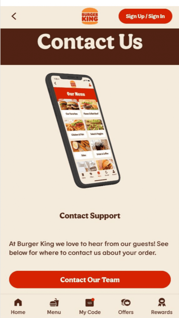
Burger King combines a simple and elegant design with an excellent user experience.
As in the previous pages, here you can find the contact details of all Burger King offices and branches, but that's not all.
Burger King also takes advantage of its contact page to get feedback from its customers. PLUS, they offer a free Whopper in exchange for completing their survey, making their contact page an exceptional plus for their customers, and also a great way to get data for their strategies.
Netflix
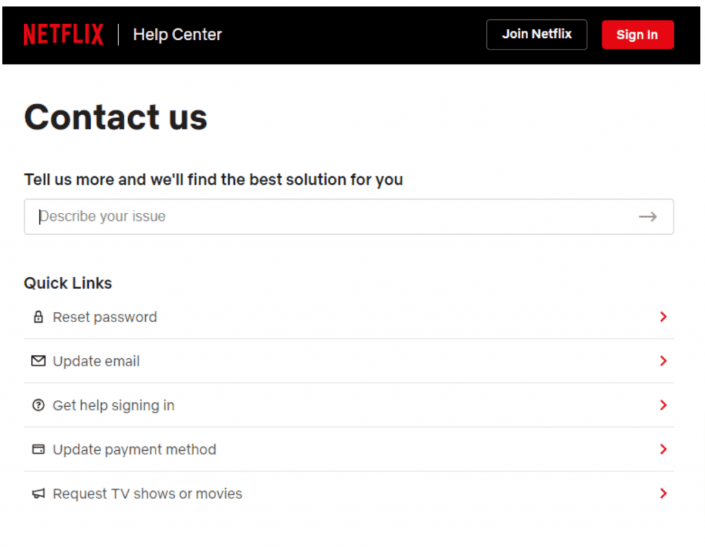
Netflix provides answers to users' most frequently asked questions right away.
It also offers different options in its search bar to contact its support team or find guides or help resources. Not to mention that both the contact page and the articles that help are available in different languages
Grammarly
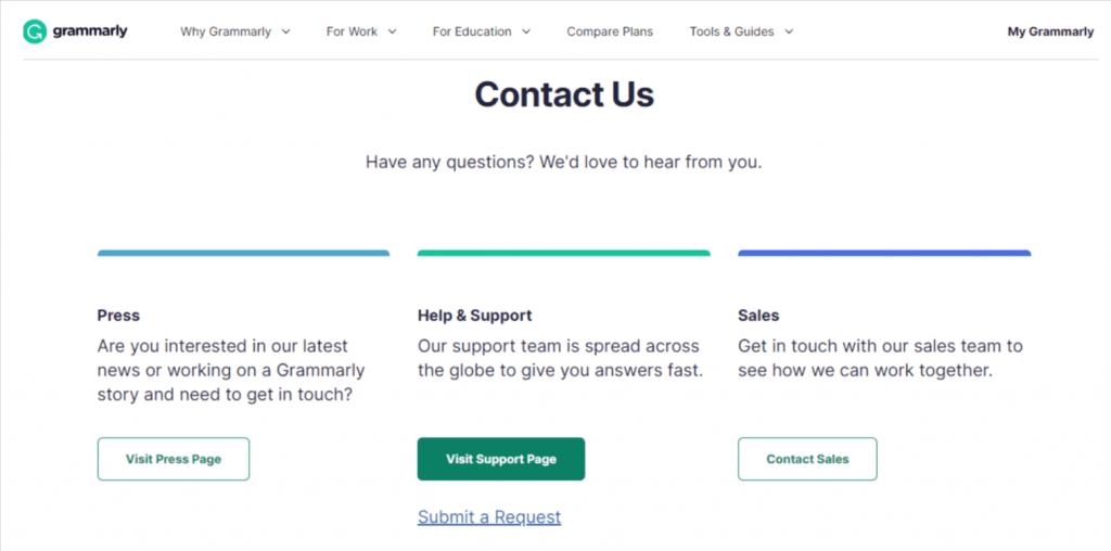
Grammarly offers 3 channels in one for different types of requests. This way, you get specialized attention and better tailored to your needs.
And if you need or prefer to write a message, Grammarly also offers you the option to send a request. You will also find Grammarly's head office details, contact numbers and email.
Tips to improve your contact page
Now, let's see how to improve your contact page to make it an infallible communication bridge:
Make it easy to find
Make it as easy to find as possible.
Place a link to the contact page in a prominent and easily accessible place on your website, such as in the navigation bar or footer. Your visitors need to be able to find it at a glance.
If they can't access your contact page, you will miss out on countless sales and customer loyalty opportunities.
Include as much data as possible
The easier it is for the user to get your contact details, as well as the data they need, the better.
Add contact information in the footer. In addition to the dedicated contact page, include basic contact information, such as your email address and phone number, in the footer of every page on the site.
Be sure to provide current and accurate contact information. If you have multiple locations or departments, make it clear so visitors know who to contact.
Likewise, offer different contact options in addition to the form, such as email and contact numbers. And if you have specific times when you answer emails or take calls, make that clear on the contact page.
Improve the user experience
The first thing is to use friendly and encouraging language. To do this, you can include a welcome message that invites visitors to contact you. Use clear and friendly language throughout the content of the page.
Also, design a contact form that is simple and easy to fill out. Include only essential fields to prevent visitors from feeling overwhelmed.
We also recommend adding an interactive map. If you have a physical location, this map will help visitors to your site find your address in seconds.
Also - and this step is vital - make sure the contact page is fully functional and easy to use on mobile devices. Remember that most users access websites from their phones.
Implement a thank you page
After visitors send a message, redirect them to a thank you page where you confirm that their message has been received and when they can expect a response.
This will also help you when building your sales funnel to know how many conversions you generate, among other KPIs.
Keep the page updated
Make sure your contact information and links are always up to date. This is especially important if you change your email address or phone number.
At the same time, periodically test the contact form and solicit feedback from users to identify weaknesses to improve.
Take care of brand consistency
Last but not least, keep the design and branding of your contact page consistent with the rest of your website.
This way, you will give more consistency and professionalism to your website and avoid possible confusion regarding the pages of your site.
A good contact page will make a big difference in your sales funnel and will be an invaluable resource in your marketing strategies.
If you follow these tips, you will have a much more efficient communication with your users. Not to mention that, by interacting directly with your site visitors, you will have better insights about the effectiveness of your website.
What do you think a contact page should have? How would you make the contact page of your website? Do you agree with our suggestions? Share all your opinions in the comments.
Looking for something specific?


